
Follow us on Facebook
Breaking updates in your feed — tap to open
In the world of software design, there exists a fundamental principle that separates exceptional user experiences from frustrating ones: the A to B principle. At its core, this concept states that software should move users from their initial state (A) to their desired outcome (B) as directly and efficiently as possible. When software fails to do this-or worse, pushes users toward an unwanted state (C)-it creates what UX professionals call an A to B violation or an A to C exception.
Despite decades of advancement in user interface design, some of the world’s most popular platforms continue to introduce friction, misdirected actions, and unnecessary steps that frustrate users and derail their tasks. From mobile operating systems to productivity apps, these violations occur more frequently than most users realize.
- The A to B Principle Explained
- Mobile Platform UX Violations
- iOS Interface Oddities
- Android and Third-Party App Challenges
- Productivity Software Friction Points
- Email and Communication Tools
- Content Creation and Publishing
- Development and System Tools
- Security and Financial Platform Hurdles
- Design Principles for Better A to B Experiences
- Minimize Interruptions
- Maintain Consistency
- Support Common Tasks
- Provide Clear Feedback
- The Future of A to B Design
- Conclusion
The A to B Principle Explained
The A to B principle represents the most basic expectation users have when interacting with software: they want to accomplish their goal with minimal interruption. State A represents where the user begins-perhaps opening an email client to reply to a message, or launching a banking app to check a balance. State B represents their intended destination-sending that reply, or viewing their account information.
When software respects this principle, users experience what psychologists call “flow”-a state of focused immersion where the interface becomes nearly invisible. When software violates it, users experience cognitive friction, frustration, and sometimes complete task abandonment.
Consider these common violations:
- Unnecessary confirmations: Asking users to confirm actions they clearly intend to perform
- Hidden controls: Burying essential functions in menus or behind gestures
- Inconsistent behavior: Changing how basic functions work across different contexts
- Over-correction: Software that “helps” by changing what users actually typed
Mobile Platform UX Violations
iOS Interface Oddities
Apple’s iOS, often praised for its intuitive design, contains several notable A to B violations. The iPhone’s undo prompt, which appears when shaking the device, frequently interrupts users who simply adjusted their grip. This creates an A to C scenario where users who wanted to continue reading (B) instead face an unwanted dialog (C).
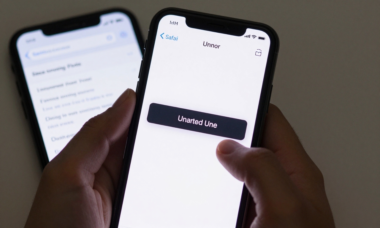
Safari’s autocomplete feature presents another challenge. While intended to speed up form completion, it often suggests incorrect information or obscures what users have actually typed, forcing them to clear suggestions before proceeding. This adds steps to what should be a straightforward task.
Even Apple’s own apps demonstrate these issues. In iMovie and Photos, certain editing controls behave inconsistently across different contexts, requiring users to relearn basic functions. The Photos app’s selection interface sometimes makes it difficult to precisely choose multiple images, turning what should be simple organization into a frustrating exercise.
Android and Third-Party App Challenges
Android platforms face similar issues. Microsoft SwiftKey, a popular third-party keyboard for both iOS and Android, occasionally exhibits buggy behavior where it miscorrects words users clearly intended, particularly around apostrophes and contractions. This transforms the simple act of typing (A to B) into a correction cycle (A to C to B).
The McDonald’s iPhone app checkout flow represents a classic case of unnecessary friction. Instead of a streamlined purchase process, users encounter multiple screens asking for information the app should already know or could reasonably infer, adding steps between hunger (A) and ordering food (B).
Productivity Software Friction Points
Email and Communication Tools
Microsoft Outlook’s web interface presents a subtle but significant A to B violation. The reply control, while present, isn’t immediately obvious to many users, particularly when viewing emails in certain layouts. Users who want to quickly respond (B) must first locate the correct button or menu option, creating unnecessary cognitive load.
This pattern repeats across communication platforms where essential functions get buried beneath layers of interface complexity. The principle suggests that the most common actions should be the most accessible, yet many productivity tools prioritize feature density over user efficiency.
Content Creation and Publishing
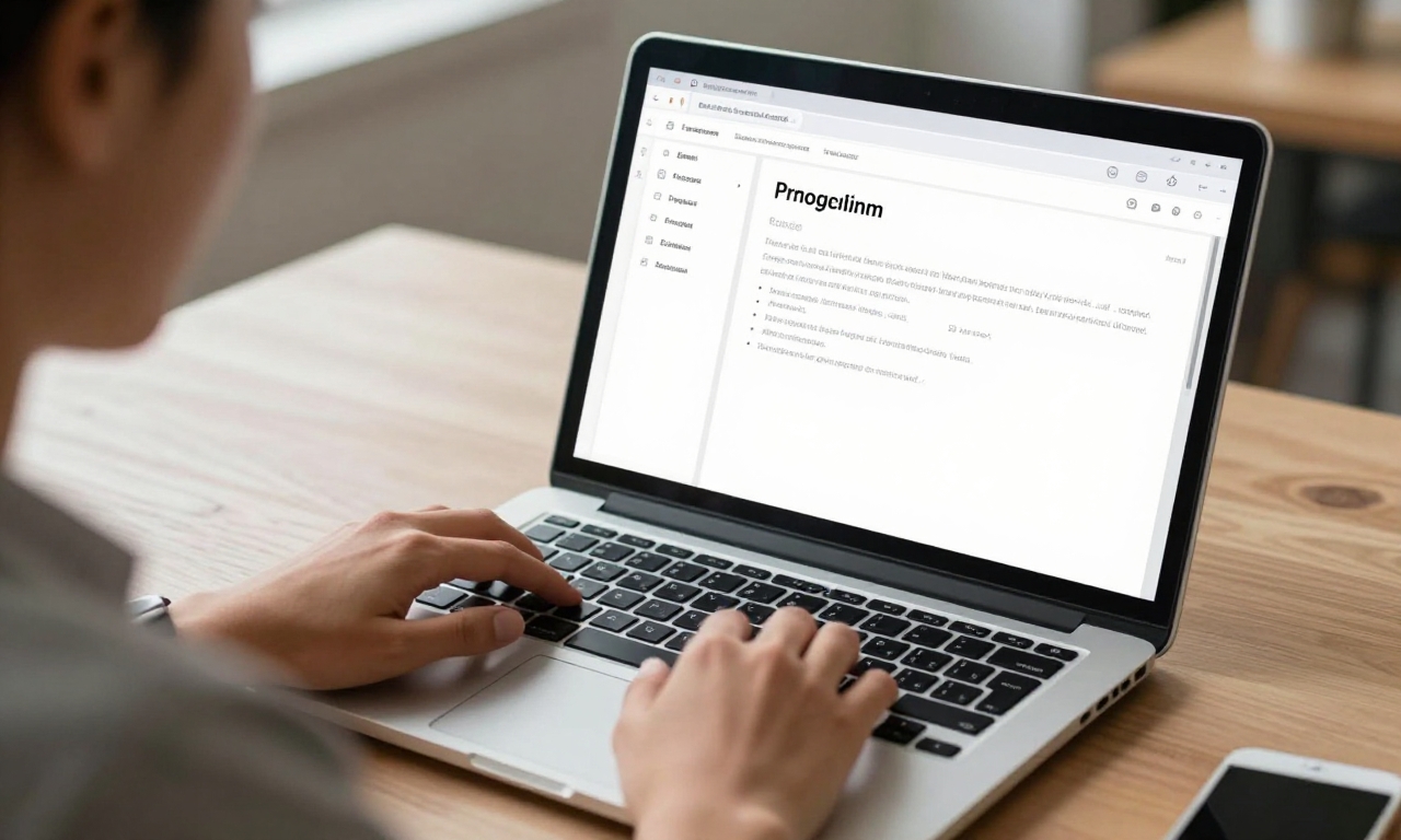
WordPress, powering millions of websites, introduces friction at critical moments. The publishing process includes multiple prompts and confirmations that interrupt the flow from writing (A) to publishing (B). While some confirmations serve legitimate purposes, their implementation often feels more like an obstacle than a safeguard.
Elementor, a popular WordPress page builder, demonstrates interface quirks that violate the A to B principle. Its drag-and-select functionality sometimes behaves unpredictably, and cursor placement issues can make precise editing frustrating. Users who want to quickly adjust a layout (B) instead find themselves fighting the interface (C).
Development and System Tools
Even tools designed for technical users suffer from A to B violations. Mac Terminal exhibits paste quirks where copied text doesn’t always paste as expected, particularly when switching between different terminal sessions or applications. This turns a simple copy-paste operation into a troubleshooting session.
Windows 11’s ongoing migration from Control Panel to Settings creates consistency issues. Users familiar with finding specific controls in the old interface must now navigate a different structure, adding learning time to what should be routine system adjustments. The transition period leaves users in an uncomfortable middle ground between two interface paradigms.
Security and Financial Platform Hurdles
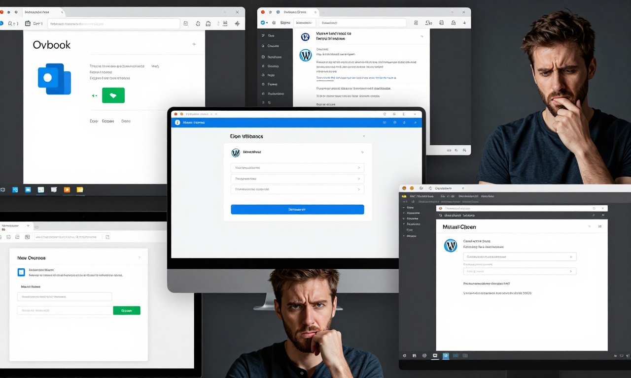
Security requirements often justify additional steps, but poor implementation creates unnecessary friction. RSA SecurID’s multi-step credential flow, while secure, could be streamlined to maintain security while reducing cognitive load. Each additional step between login attempt (A) and access (B) increases the chance of user error or abandonment.
Banking platforms like Axos Bank demonstrate how security measures can interfere with user goals. The login sequence sometimes feels more like an obstacle course than a gateway, with multiple screens and validations that could be consolidated without compromising security.
Quest Diagnostics’ “cookie-first” login approach represents another A to B violation. Before users can access their medical information, they must navigate cookie consent dialogs-a process unrelated to their primary goal of viewing test results. This inserts an unrelated decision point between two related actions.
Design Principles for Better A to B Experiences
Creating software that respects the A to B principle requires intentional design choices. Here are key principles developers and designers should consider:
Minimize Interruptions
Every dialog, confirmation, or prompt represents a potential A to B violation. Before adding an interruption, ask: Is this absolutely necessary? Could this information be presented non-modally? Could the action be undoable rather than confirmed?
Apple’s approach to iOS updates-downloading in the background and asking to install later-respects this principle better than systems that interrupt workflow with update prompts.
Maintain Consistency
When basic functions like text selection, navigation, or action confirmation work differently across an application or platform, users must constantly reorient themselves. Consistent behavior reduces cognitive load and helps users move predictably from A to B.
Google’s Material Design guidelines attempt to address this by providing consistent patterns across Android applications, though implementation varies.
Support Common Tasks
Identify the most frequent user journeys and optimize ruthlessly for them. If 80% of users want to accomplish the same handful of tasks, those tasks should have the most direct paths with the fewest obstacles.
Streamlining common actions like replying to messages, publishing content, or completing purchases should take priority over edge cases or advanced features.
Provide Clear Feedback
When users take action, they should immediately understand what happened and what comes next. Ambiguous or delayed feedback creates uncertainty about whether they’re moving from A to B or somewhere else entirely.
Visual cues, progress indicators, and clear error messages help users maintain their orientation toward their goal.
The Future of A to B Design
As artificial intelligence becomes more integrated into software interfaces, new opportunities emerge for respecting the A to B principle. Predictive interfaces that anticipate user needs could reduce steps between intention and action. Context-aware systems could eliminate unnecessary confirmations by understanding user patterns.
However, AI also introduces new risks. Overly aggressive autocorrect, like that seen in some keyboard apps, represents AI violating the A to B principle by changing user intent. The challenge will be implementing AI assistance that truly reduces friction rather than creating new forms of it.
Platforms like ChatGPT demonstrate both the potential and pitfalls of AI interfaces. While capable of understanding natural language requests (A) and providing helpful responses (B), they sometimes introduce unnecessary verbiage, disclaimers, or formatting that distracts from the core exchange.
Conclusion
The A to B principle serves as a valuable lens for evaluating software user experience. By examining how popular platforms from Apple, Google, Microsoft, and others introduce friction, we can identify patterns to avoid and principles to embrace.
For users, understanding this principle provides vocabulary for articulating why certain software feels frustrating. For designers and developers, it offers a clear standard: software should help users reach their goals with minimal interference.
As technology continues to evolve, respecting the fundamental journey from intention to outcome remains essential. Whether using smartphones, productivity software, or emerging AI tools, users deserve interfaces that understand where they want to go and help them get there directly.