Follow us on Facebook
Breaking updates in your feed — tap to open
When Apple unveiled its Liquid Glass design language across macOS, iPadOS, and iOS, it promised a cohesive, modern aesthetic that would unify the Apple ecosystem. As users and designers, we approached this redesign with a mix of excitement and skepticism. After extensive testing across devices, we’ve discovered a UI transformation that’s both beautifully polished in places and frustratingly inconsistent in others. This article provides a comprehensive, consumer-focused breakdown of what works, what doesn’t, and what it means for your daily Apple experience.
- What Exactly Is Apple’s Liquid Glass Design?
- iOS: Where Liquid Glass Shines Brightest
- Fluid Animations That Feel Natural
- Consistent Glass Effects
- Practical Benefits for Users
- macOS: The Inconsistent Middle Child
- The Glass Application Problem
- Dark/Light Mode Inconsistencies
- The Photos App Debacle
- Menubar Background Removal: A Surprising Win
- iPadOS: Finding the Middle Ground
- Consistent Visual Language
- Functional Windowing Features
- Persistent Design Quirks
- Design Elements That Divide Opinion
- Icon Redesign Hits and Misses
- Floating Elements and Shadows
- Repetitive Glass Effects
- The Verdict: Foundationally Strong but Needs Refinement
- What Works Exceptionally Well
- Areas Needing Immediate Attention
- Looking Toward the Future
What Exactly Is Apple’s Liquid Glass Design?
At its core, Liquid Glass isn’t just about adding transparent, glass-like elements to your interface. It’s a comprehensive design philosophy that encompasses several key components working together to create a unified visual language across all Apple operating systems.
The “liquid” aspect refers to fluid animations and transitions that make interactions feel more natural and responsive. When you open an app, switch between windows, or scroll through menus, you’ll notice smoother motion that mimics real-world physics. The “glass” element brings translucency and depth through layered components that allow background content to subtly show through, creating a sense of hierarchy and sophistication.
Additional design pillars include:
- Rounded corners: Softer edges throughout the interface
- Layered components: Visual depth through stacking elements
- Cohesive color palettes: Consistent tones across all apps
- Unified iconography: Redesigned symbols that match the new aesthetic
This represents one of Apple’s most ambitious design undertakings in recent years, aiming to create a seamless experience whether you’re using an iPhone, iPad, or Mac.
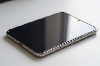
iOS: Where Liquid Glass Shines Brightest
Apple’s mobile operating system received the most polished implementation of the Liquid Glass design. If you’re primarily an iPhone user, you’re in for a treat with some genuinely impressive visual improvements.
Fluid Animations That Feel Natural
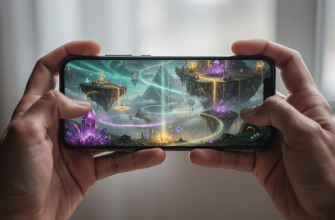
The “liquid” aspect truly comes alive on iOS. Swipe gestures, app transitions, and menu animations have been refined to feel more organic. When you switch between apps, they don’t just appear-they flow into place with subtle momentum that mimics physical objects. This attention to motion detail makes the entire interface feel more responsive and premium.
Consistent Glass Effects
Unlike its desktop counterpart, iOS maintains remarkable consistency in how glass effects are applied. Control Center, notification panels, and system menus all feature the same level of translucency with appropriate blurring of background content. The dark and light modes work predictably, adjusting transparency based on your system settings without unexpected behavior changes.
Practical Benefits for Users
Beyond aesthetics, these design choices offer real usability improvements:
- Better visual hierarchy: Layered elements help distinguish between foreground and background content
- Reduced eye strain: Softer edges and consistent transparency create less harsh visual boundaries
- Intuitive interactions: The fluid animations provide better feedback for your gestures
For iPhone users, Liquid Glass represents a clear step forward in both beauty and functionality.
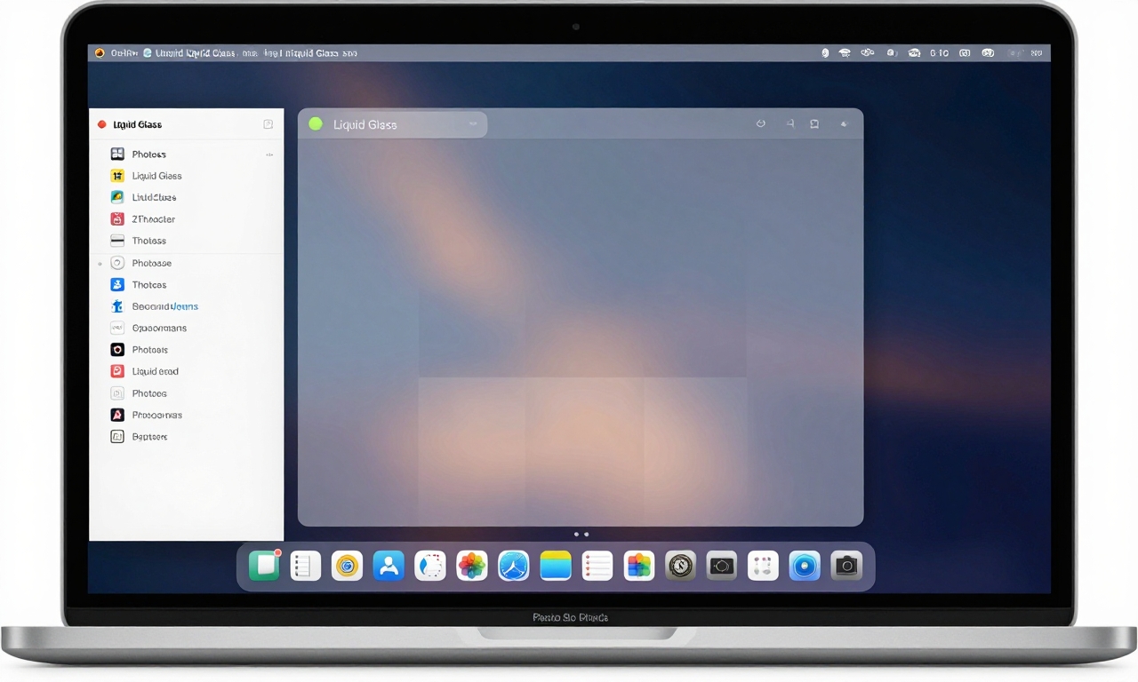
macOS: The Inconsistent Middle Child
While iOS enjoys a polished implementation, macOS presents a more mixed bag. The desktop operating system shows clear signs of being a work in progress, with some elements beautifully executed and others feeling oddly amateurish.
The Glass Application Problem
One of the most noticeable issues on macOS is the uneven application of glass effects across different interface elements. Here’s what we observed:
| Interface Element | Glass Implementation | User Experience Impact |
|---|---|---|
| System Menus | Consistent, appropriate transparency | Positive – clear hierarchy |
| Notification Center | Inconsistent, sometimes missing | Confusing – breaks visual flow |
| App Windows | Variable by application | Frustrating – no uniform experience |
Dark/Light Mode Inconsistencies
The behavior of glass elements changes unpredictably depending on your background content and system theme. In some apps, dark mode glass appears appropriately subtle, while in others it becomes overly opaque or strangely colored. This inconsistency can be distracting and makes the system feel less polished than it should.
The Photos App Debacle
Perhaps the most glaring issue appears in Apple’s own Photos application. The background darkening effect when viewing images feels heavy-handed and amateurish, detracting from the photography experience rather than enhancing it. It’s a surprising misstep from a company known for its design excellence.
Menubar Background Removal: A Surprising Win
One controversial change that grew on us was the removal of the solid menubar background. Initially disorienting, the transparent menubar eventually revealed its benefits:
- More screen real estate: The interface feels less cramped
- Better wallpaper integration: Your desktop background shines through
- Modern aesthetic: Aligns with current design trends
While it takes adjustment, this change ultimately contributes to a cleaner, more modern desktop experience.
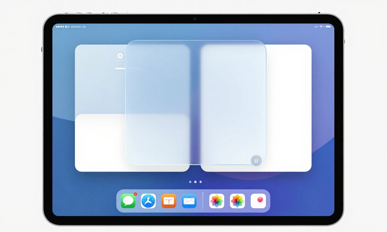
iPadOS: Finding the Middle Ground
Apple’s tablet operating system strikes an interesting balance between iOS’s polish and macOS’s functionality, making it perhaps the most practical implementation of Liquid Glass for daily use.
Consistent Visual Language
iPadOS maintains more uniform glass effects than macOS while introducing useful functional improvements. The transparency levels feel appropriate across different contexts, and the system handles background content blurring more predictably than its desktop counterpart.
Functional Windowing Features
Where iPadOS truly shines is in its practical application of the new design language to productivity features:
- Floating windows: Apps can hover above others with appropriate glass effects
- Split-view improvements: Better visual separation between app panes
- Slide Over enhancements: Smoother transitions between secondary apps
Persistent Design Quirks
Despite the overall consistency, some odd design choices remain. Larger window curves on certain elements can feel exaggerated, and floating buttons with drop shadows sometimes appear disconnected from the overall aesthetic. These aren’t deal-breakers, but they prevent the experience from feeling completely seamless.
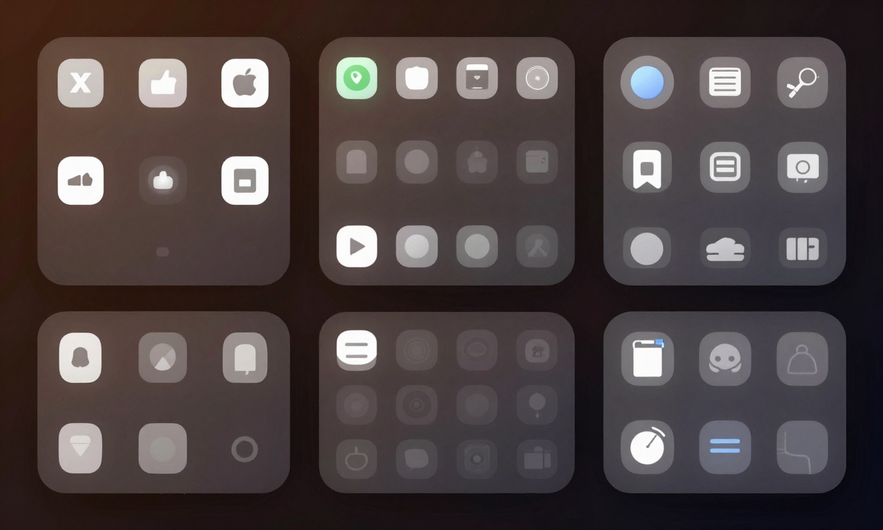
Design Elements That Divide Opinion
Several specific design choices within the Liquid Glass framework have generated mixed reactions from users and designers alike. Understanding these elements helps explain why the redesign feels simultaneously modern and unfinished.
Icon Redesign Hits and Misses
Apple’s icon overhaul has been particularly controversial. While many system icons received thoughtful updates that better reflect the new design language, others feel like steps backward. The internal drive icon, for example, lost clarity and immediate recognizability in its simplified form. This inconsistency in icon quality contributes to the feeling that different teams worked on different parts of the system without complete coordination.
Floating Elements and Shadows
The use of floating buttons and elements with drop shadows creates visual depth but can sometimes feel excessive. When overused, these effects make the interface feel cluttered rather than layered. The key issue is inconsistency-some apps use these elements sparingly and effectively, while others apply them liberally without clear purpose.
Repetitive Glass Effects
There’s a legitimate concern about visual fatigue from the pervasive glass effects. When every menu, panel, and dialog features transparency, the distinctive quality of the effect diminishes. Strategic use of solid backgrounds in certain contexts could actually enhance the glass elements by providing contrast and rest points for the eyes.
The Verdict: Foundationally Strong but Needs Refinement
After living with Apple’s Liquid Glass redesign across multiple devices, we’ve reached a clear conclusion: this is a foundationally strong design language that shows tremendous promise but requires significant refinement to reach its full potential.
What Works Exceptionally Well
- Unified aesthetic: Finally, a cohesive look across Apple’s ecosystem
- iOS implementation: Polished, fluid, and genuinely enjoyable
- System stability: Despite visual inconsistencies, the systems remain stable
- Future potential: The foundation is solid for ongoing improvements
Areas Needing Immediate Attention
- macOS consistency: Uniform glass application is essential
- Icon coherence: All system icons need the same level of polish
- Visual glitch elimination: Occasional rendering issues must be addressed
- Strategic solid backgrounds: Not every element needs transparency
Looking Toward the Future
The most encouraging aspect of Liquid Glass is its evolutionary nature. Apple has demonstrated willingness to refine its design language over multiple updates, and the current implementation feels like a strong first draft rather than a final product. As the company addresses the inconsistencies and refines the rough edges, this design language has the potential to age beautifully and feel modern for years to come.
For consumers, the message is clear: if you value a unified, modern aesthetic and can tolerate some growing pains, Liquid Glass represents a positive direction for Apple’s ecosystem. The polish on iOS alone makes it worth embracing, and with expected refinements to macOS and iPadOS, the complete experience should only improve with time.
“Liquid Glass feels like Apple’s most ambitious design undertaking in a decade-flawed in execution but brilliant in concept, with the potential to define their visual language for years to come.”
As with any major redesign, patience and perspective are key. What feels inconsistent today may feel cohesive tomorrow as Apple continues to iterate and improve. For now, we recommend embracing the fluidity of iOS, tolerating the inconsistencies of macOS, and appreciating the balanced approach of iPadOS-all while looking forward to the refinements that will undoubtedly come.