Follow us on Facebook
Breaking updates in your feed — tap to open
In the world of smartphone design, Apple has long been celebrated for its sleek aesthetics and intuitive interfaces. From the iconic iPhone to the seamless iPad experience, the company’s design philosophy has influenced an entire industry. However, a critical examination of Apple’s recent Liquid Glass design approach reveals a troubling trend: prioritizing visual beauty over functional clarity has created fundamental problems that affect millions of users daily.
This isn’t just about minor visual glitches or occasional bugs. We’re talking about a design decision that breaks the established contract between operating system and website, creating a contradictory experience where users see content in areas developers cannot control. The result? Widespread display issues, interaction problems, and a compromised user experience that affects even Apple’s own properties.
- The Liquid Glass Conundrum: Beauty That Breaks
- The Real-World Impact: When Design Fails Users
- Widespread Display Issues
- The Developer’s Dilemma
- The Philosophy of Good Design: Function Before Form
- Humility in Design
- A Call for Responsibility: Fixing What’s Broken
- What Apple Must Do
- The Role of Developers and Users
- The Future of Mobile Design
The Liquid Glass Conundrum: Beauty That Breaks
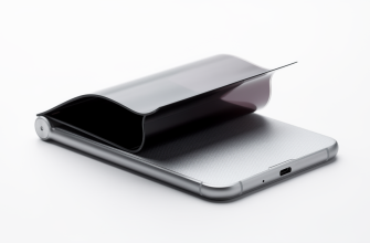
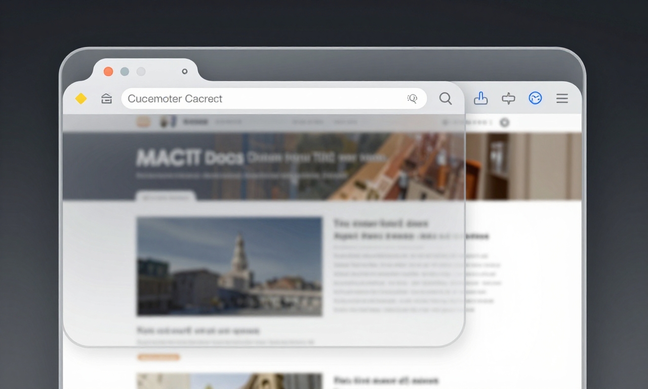
Apple’s Liquid Glass design represents a fundamental shift in how browser interfaces interact with web content. Instead of treating the browser UI as a distinct, functional element, Apple’s design team created what can only be described as a “pseudo-viewport”-a transparent layer that visually floats above web content while technically remaining outside the viewport.
This approach creates a contradiction at the heart of the user experience:
- Visual Integration: The browser UI appears seamlessly integrated with web content
- Technical Separation: The system treats these elements as separate entities
- Control Disconnect: Users see content in areas developers cannot control
- Contract Breach: The established rules of web development are violated
The core issue stems from Apple’s design process itself. Rather than starting with the fundamental question-“What are we designing?”-the team focused primarily on how their browser UI would look. This visual-first approach led to decisions that prioritized aesthetic appeal over functional clarity.
The Real-World Impact: When Design Fails Users
Widespread Display Issues
The consequences of Apple’s Liquid Glass design are far from theoretical. Millions of mobile-optimized websites now experience display problems that range from minor annoyances to critical functionality issues:
- Overlay Glitches: Navigation elements that appear in wrong positions
- Layout Inconsistencies: Content that shifts unexpectedly during scrolling
- Interaction Problems: Touch targets that don’t respond as expected
- Visual Artifacts: Strange rendering issues during transitions
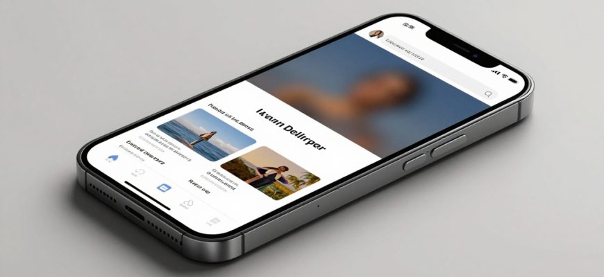
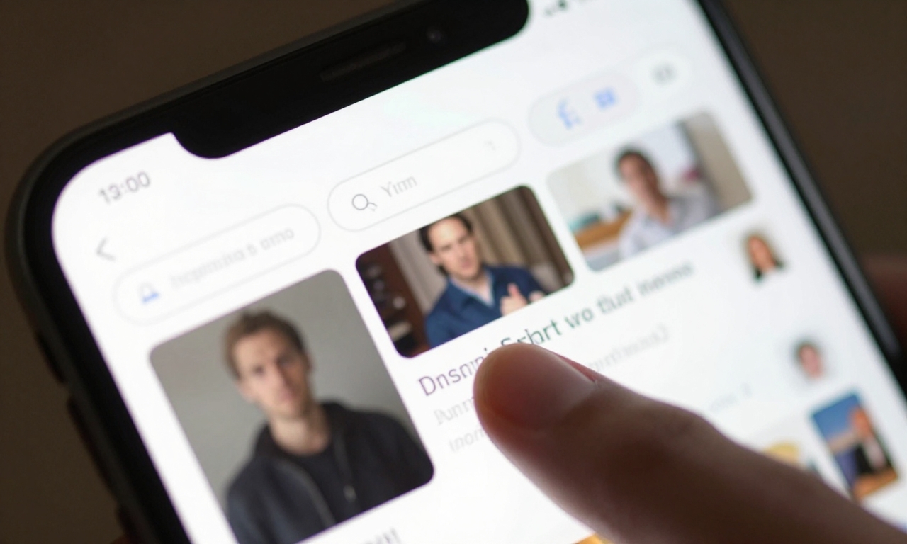
Even Apple’s own website isn’t immune to these problems. Visitors to Apple.com on iOS devices have reported various display issues where overlays create layout glitches and visual inconsistencies. If the company that created the design standard can’t implement it flawlessly on their own properties, what hope do independent developers have?
The Developer’s Dilemma
For web developers, Apple’s Liquid Glass design creates an impossible situation. They’re asked to create websites that work within a system that doesn’t provide clear boundaries or consistent rules. The pseudo-viewport means developers must account for areas they cannot control, leading to:
- Increased Development Time: More testing and debugging required
- Higher Maintenance Costs: Constant updates to address new issues
- Compromised Designs: Simplifying interfaces to avoid problems
- Frustration and Burnout: Fighting against an unpredictable system
The Philosophy of Good Design: Function Before Form
True design excellence begins with clear definitions, not visual presentations. Before a single pixel is placed, designers should ask fundamental questions:
“What are we creating? Who does it serve? What problem does it solve?”
Apple’s Liquid Glass approach reverses this process. By starting with visual aesthetics and working backward to functionality, the company has created a beautiful but broken system. The interface may shine visually, but it fails to serve users effectively.
Humility in Design
Good design requires humility-the recognition that established standards exist for good reasons. When Apple decided to break the traditional viewport contract, they disregarded years of web development conventions that ensured consistency and reliability. True design humility means:
| Traditional Approach | Liquid Glass Approach |
|---|---|
| Respects established standards | Creates new, proprietary rules |
| Prioritizes user context | Prioritizes visual appeal |
| Maintains clear boundaries | Blurs functional lines |
| Serves user needs first | Serves brand aesthetics first |
The crucial boundary between visibility and control must be respected. Users should never see content in areas where developers cannot implement proper functionality. This isn’t just a technical requirement-it’s a fundamental principle of ethical design.

A Call for Responsibility: Fixing What’s Broken
What Apple Must Do
As the creator of this design approach, Apple bears primary responsibility for fixing the problems it has created. The company needs to:
- Re-evaluate the Design: Return to first principles and ask the right questions
- Provide Clear Documentation: Give developers proper guidance and tools
- Fix Core Issues: Address the fundamental contradictions in the system
- Respect Standards: Work within established web conventions
Apple has the resources and talent to create beautiful interfaces that also function perfectly. The company needs to redirect its design philosophy back toward serving users rather than impressing them visually.
The Role of Developers and Users
This isn’t just Apple’s problem to solve. The entire ecosystem has a role to play:
- Developers: Continue advocating for better standards and documentation
- Users: Report issues and demand better experiences
- Industry: Establish clearer guidelines for mobile interface design
- Media: Hold companies accountable for design decisions
By working together, all stakeholders can push for design that prioritizes functional clarity over visual effects that compromise user experience.
The Future of Mobile Design
The Liquid Glass controversy serves as a crucial lesson for the entire tech industry. As we move toward more immersive interfaces, augmented reality experiences, and next-generation mobile devices, we must remember that good design always begins with clear definitions.
The most beautiful interface in the world means nothing if it doesn’t work properly. Visual aesthetics should enhance functionality, not replace it. As users demand more from their devices and developers create increasingly sophisticated web experiences, the need for clear, consistent design principles has never been greater.
Apple has an opportunity to lead by example-not just in creating beautiful designs, but in creating designs that work beautifully. By returning to a philosophy that prioritizes user needs over visual appeal, the company can fix the problems created by Liquid Glass and set a new standard for responsible, effective design.
The choice is clear: continue prioritizing aesthetics at the expense of functionality, or return to the fundamental principles that made Apple’s designs revolutionary in the first place. The future of mobile browsing depends on getting this right.