Follow us on Facebook
Breaking updates in your feed — tap to open
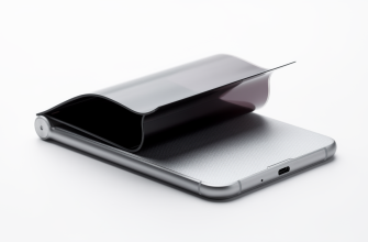
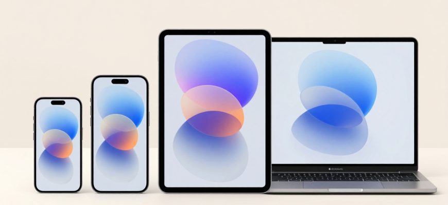
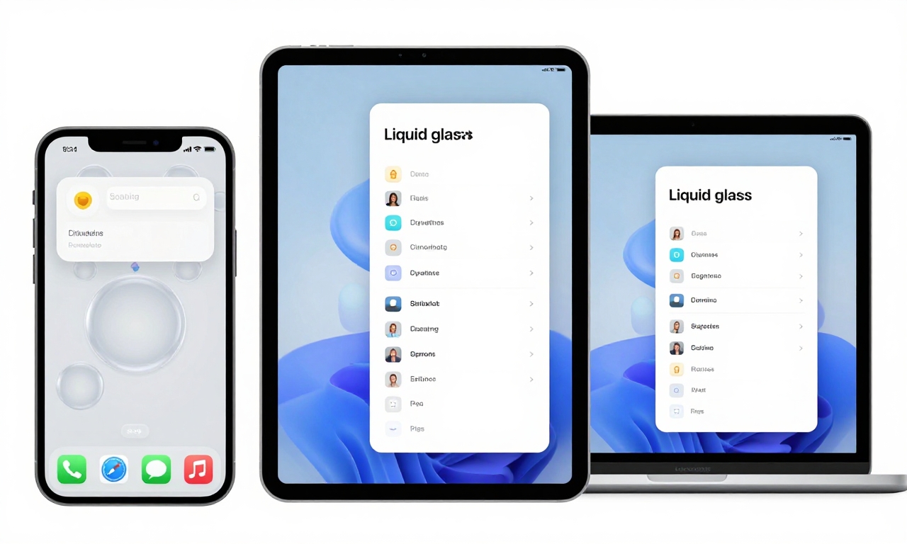
Apple has unveiled its next-generation operating systems with iOS 26, iPadOS 26, and macOS 26, introducing the much-anticipated Liquid Glass design language. While Apple promises a revolutionary interface that lets content “shine through,” our early hands-on experience reveals a more complex reality. The design feels less like flowing liquid and more like playful bubbles-sometimes charming, sometimes chaotic. As we dive into these pre-release versions, we’re discovering how this visual overhaul impacts usability across iPhone, iPad, and Mac devices, alongside several functional updates that range from genuinely useful to questionably implemented.
- The Liquid Glass Illusion: Bubbles Instead of Liquid
- Platform Performance: Where Liquid Glass Works (And Where It Doesn’t)
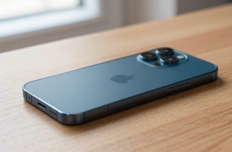
- iPhone: The Clutter Conundrum
- iPad Pro: Finding Its Footing
- macOS: Subtle But Significant Shifts
- Functional Updates: The Good, The Bad, and The Mixed
- Positive Improvements Worth Celebrating
- Questionable Changes and Missed Opportunities
- Features Generating Mixed Reactions
- Looking Ahead: The 2026 Evolution
The Liquid Glass Illusion: Bubbles Instead of Liquid
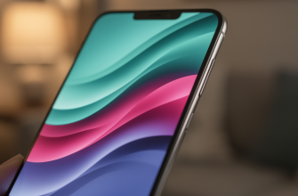
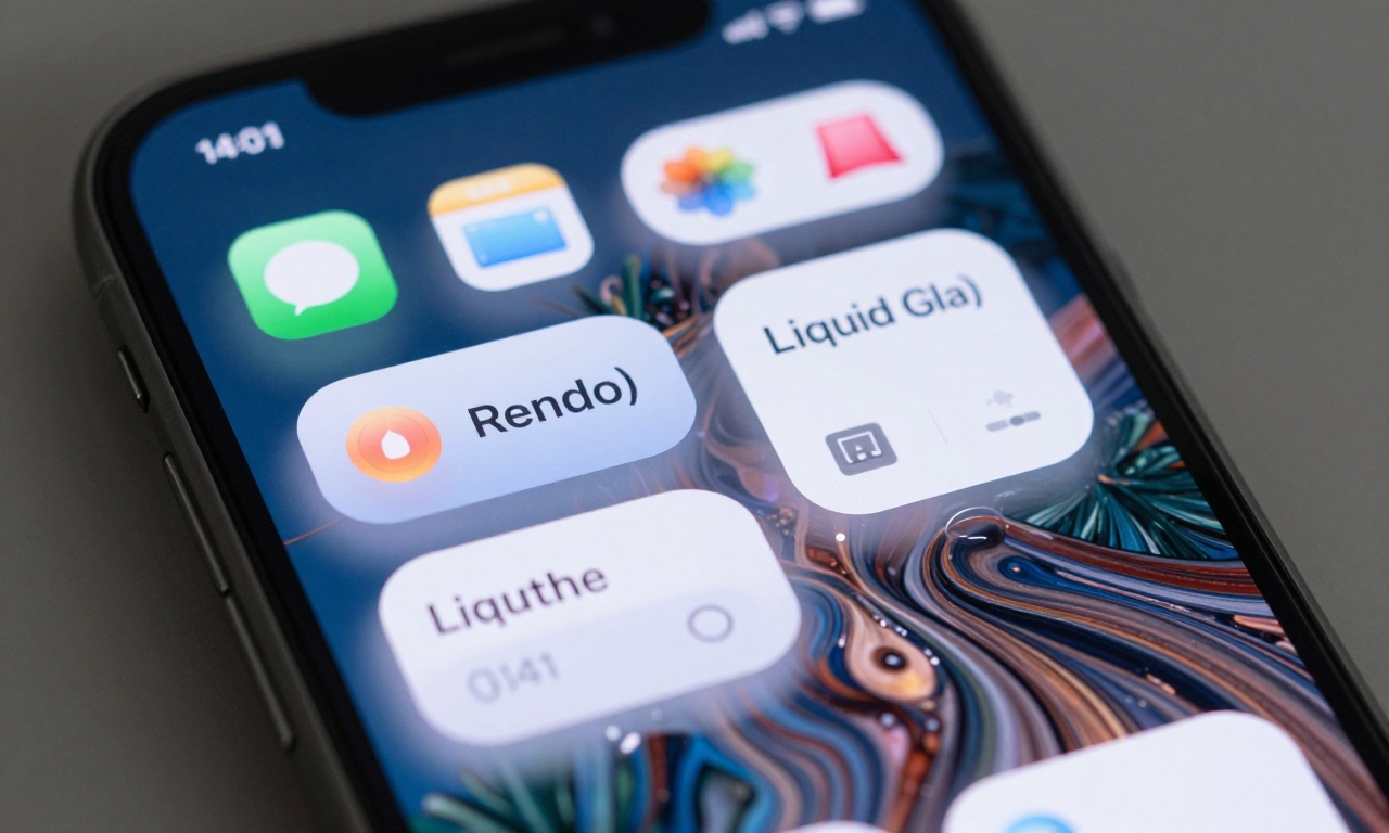
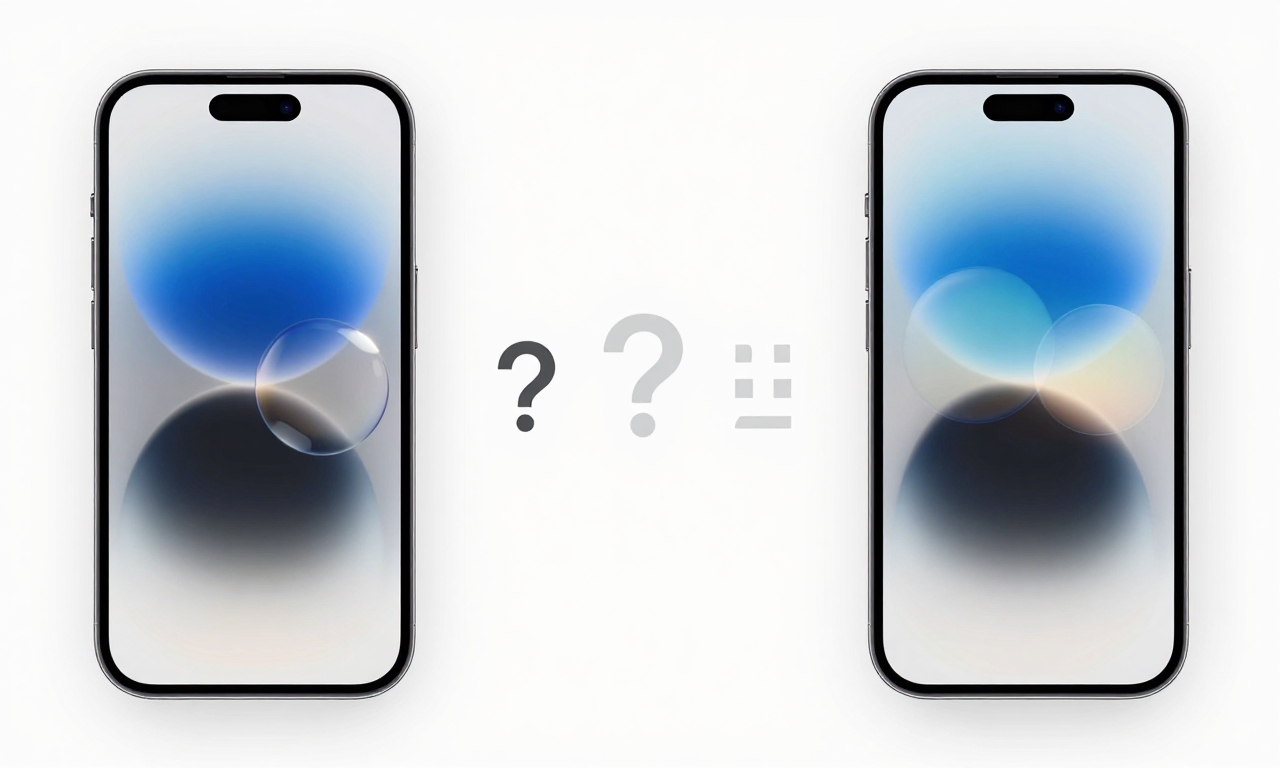
Apple’s marketing materials for Liquid Glass suggest a sleek, flowing interface where content appears to float beneath a crystalline surface. In practice, however, the design language feels distinctly bubbly-rounded, plump UI elements that create a whimsical, almost child-like aesthetic. The transparency effects that Apple touted as letting content “shine through” often result in visual elements that “bleed through” instead, creating distracting layers that can compromise legibility.
On the iPhone, this bubbly approach presents particular challenges. The smaller screen magnifies the chunkier design elements, and when combined with complex wallpapers, the light-leaking effects can create genuine visual clutter. Text sometimes appears to float awkwardly above background elements, and the rounded corners on everything from buttons to notification cards can make the interface feel less precise than previous iOS versions.
Platform Performance: Where Liquid Glass Works (And Where It Doesn’t)
iPhone: The Clutter Conundrum
The iPhone experience with Liquid Glass highlights the design’s limitations on smaller screens. The bubbly UI elements consume more visual real estate than their predecessors, making some interfaces feel cramped despite the same physical dimensions. The transparency effects, while technically impressive, often create distracting visual noise-particularly with busy wallpapers where light appears to “leak” around icons and text in ways that can strain the eyes during extended use.
iPad Pro: Finding Its Footing
Where the iPhone struggles, the iPad Pro thrives with Liquid Glass. The larger screen provides the breathing room these chunkier design elements desperately need. Buttons feel appropriately sized rather than oversized, and the transparency effects work more harmoniously with the additional screen real estate. The design language actually enhances the iPad’s premium feel, creating a more immersive experience that leverages the device’s capabilities better than on smaller screens.
macOS: Subtle But Significant Shifts
On the Mac, Liquid Glass manifests more subtly but no less significantly. Rounded corners appear throughout the interface, from window edges to button designs, contributing to what some testers describe as a “more cartoonish” feel. The changes are less dramatic than on iOS devices but collectively shift macOS’s aesthetic toward Apple’s new design direction. Some long-time Mac users may find the adjustments jarring, while newcomers might appreciate the consistency across Apple’s ecosystem.
Functional Updates: The Good, The Bad, and The Mixed
Positive Improvements Worth Celebrating
Beyond the visual overhaul, several functional updates show genuine promise:
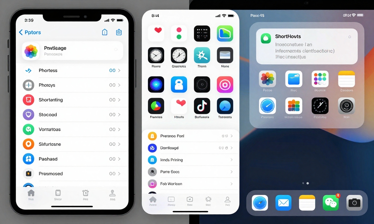
- Photos App Enhancements: The redesigned Photos app introduces smarter organization and more powerful editing tools that leverage machine learning more effectively.
- iPad Multitasking Evolution: While some miss the simplicity of Slide Over, the new multitasking system offers more flexibility for power users working with multiple apps simultaneously.
- Apple Watch Gesture: A new subtle gesture allows for quicker interactions without needing to touch the screen-perfect for situations where hands are occupied.
- Whimsical Mac Trash Icon: The animated trash icon adds personality to file management, though its practical value remains primarily aesthetic.
Questionable Changes and Missed Opportunities
Not every update hits the mark in these early versions:
- Shortcuts Menu Bar Implementation: The new macOS menu bar placement for Shortcuts feels less efficient than previous versions, requiring more clicks for common actions.
- Redesigned Icons: Some app icons have been redesigned with mixed results-certain designs feel fresh and modern, while others sacrifice clarity for style.
Features Generating Mixed Reactions
Several additions have divided early testers:
- Icon Tinting System: This feature extends to widgets as well, allowing for more personalized home screens but sometimes creating visual inconsistency across apps.
- Menu Bar Hiding Behavior: The new automatic hiding feature works well in full-screen mode but can be frustrating during regular use when important controls disappear unexpectedly.
- Accessibility Integration: While improved overall, some specific accessibility features feel less intuitive in the new design language.
Looking Ahead: The 2026 Evolution
It’s crucial to remember that these are early impressions based on pre-release software. Apple typically refines its operating systems significantly between initial developer betas and public releases. The full evaluation of Liquid Glass and its accompanying features will likely extend well into 2026 as developers adapt their apps and users adjust to the new interface paradigms.
The success of this design language may ultimately depend on how Apple responds to early feedback. Will they dial back the more extreme bubbly elements on iPhone? Will they enhance the transparency effects to truly let content shine through rather than bleed through? These questions will be answered in the coming months as the software matures.
For now, Liquid Glass represents Apple’s boldest visual departure in years-a design language that prioritizes whimsy and personality over stark minimalism. Whether this shift resonates with users or feels like a step backward in usability remains to be seen, but one thing is certain: Apple isn’t playing it safe with its 2026 operating systems.