Follow us on Facebook
Breaking updates in your feed — tap to open
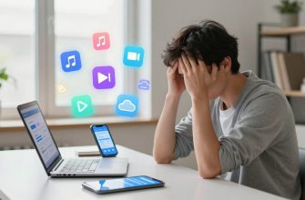
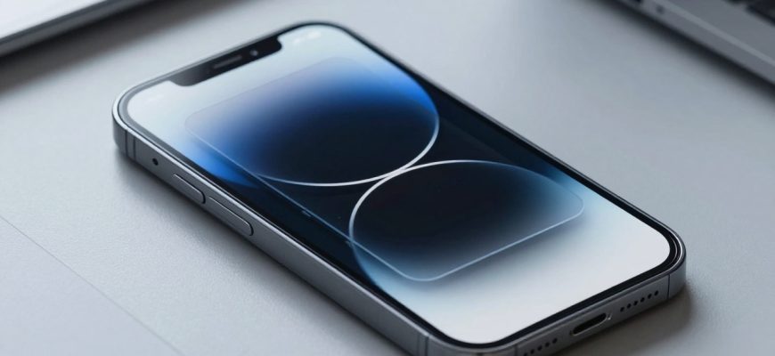
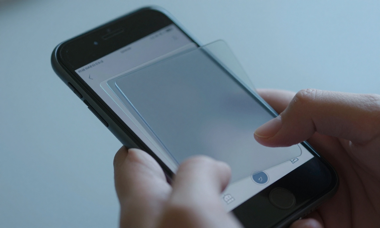
Liquid Glass marks a shift in how we experience depth on screens. Rather than relying on a single trick, designers blend glass-like depth, textured surfaces, subtle highlights, and responsive motion to create interfaces that feel tangible and alive. This piece traces that journey—from early skeuomorphic cues toward depth-aware UI patterns—guided by Apple’s design evolution and the belief that delightful interfaces matter because people spend hours with devices. Liquid Glass serves as a starting point for expanding UI depth through occlusion, shader-based transforms, and playful interactions, illustrated by a personal project pairing a cold-swimming aesthetic with a liquid-ice texture and a ripple on tap.
From Skepticism to Delight: The Anatomy of Liquid Glass
Depth is more than a visual flourish; it becomes a navigational cue. Liquid Glass blends several depth cues into a coherent language: occlusion where surfaces overlap with believable shadows; layered surfaces that stack and glide; subtle specular highlights that shift with the viewer’s angle; and motion that responds to taps and swipes. The result is a UI that feels tangible, guiding the eye along a path rather than simply presenting content.
Good depth is not about spectacle; it’s about clarity. When surfaces recede or advance in a controlled way, users infer hierarchy without being overwhelmed. Texture and tone help content breathe on small screens, so text remains legible even as cards glide in three dimensions.
Designers must strike a balance. If depth is too aggressive, interfaces become distracting; if too muted, the interface risks feeling flat and utilitarian. The best approaches weave depth into the task flow—helping users locate the primary action, compare options, and understand context at a glance.
Ultimately, depth is a language. It teaches users what to do next by offering predictable, tactile feedback and a sense of continuity across screen transitions. This article looks at how that language evolved and how it can be extended beyond a single trick to a robust toolkit for humane interfaces.
What Apple Learned: Designing for Depth and Usability
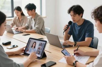
Apple’s ongoing design evolution shows how depth can enhance usability without sacrificing clarity. Across iOS and iPadOS, depth cues help separate content types, emphasize primary actions, and create a hierarchy that remains legible in both light and dark modes. The company demonstrates that depth works best when it supports the user’s goals: it should guide attention, not decorate the screen.
Key takeaways include the alignment of depth with motion and timing. Gentle parallax and card-level depth can clarify navigation when integrated with consistent gestures and predictable transitions. Color choices and shading remain critical: contrast and legibility must be preserved as surfaces move and resize. Personalization options—simple light, dark, or clear modes—mirror a broader industry trend toward accessibility and customization.
For designers, the lesson is straightforward: depth is a system, not a single flourish. When depth cues are stable, purposeful, and performance-minded, the interface feels both premium and approachable. The payoff is an experience that users remember for the right reasons: it is easy to use, but it also feels lively and modern.
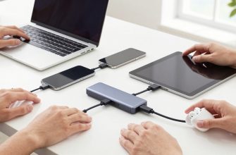
Practical Techniques: Occlusion, Shader Transforms, and Playful Interactions
Occlusion is a practical tool for conveying depth: cards slide over or behind one another, while the content behind remains visible enough to provide context. The trick is to reveal just enough without exposing the wrong information. In liquid-style designs, occlusion can be paired with subtle shadows and soft light to mimic real-world layering, improving readability as surfaces move.
Shader-based transforms move interface surfaces in ways that feel tactile rather than mechanical. By shifting geometry, lighting, and color values in real time, developers can create glints, ripples, and color shifts that respond to user input—without sacrificing performance. The goal is to make transitions feel continuous and natural, not abrupt or jarring.
Playful interactions—micro-animations, ripple effects on tap, and context-aware feedback—are the finishing touches that prevent depth from feeling sterile. When these micro-motions align with the user’s actions, they become navigational cues rather than purely aesthetic flourishes. The result is a more engaging, humane interface that still respects speed and readability.
Depth cues should support task flow rather than distract users. When occlusion and motion feel consistent and purposeful, interfaces become more tangible and intuitive. Delight emerges from predictability and subtlety, not gimmicks.
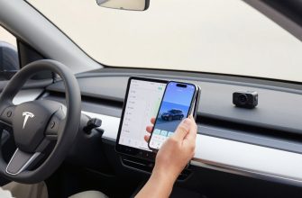
Beyond Nostalgia: Personal Projects and Future Prospects
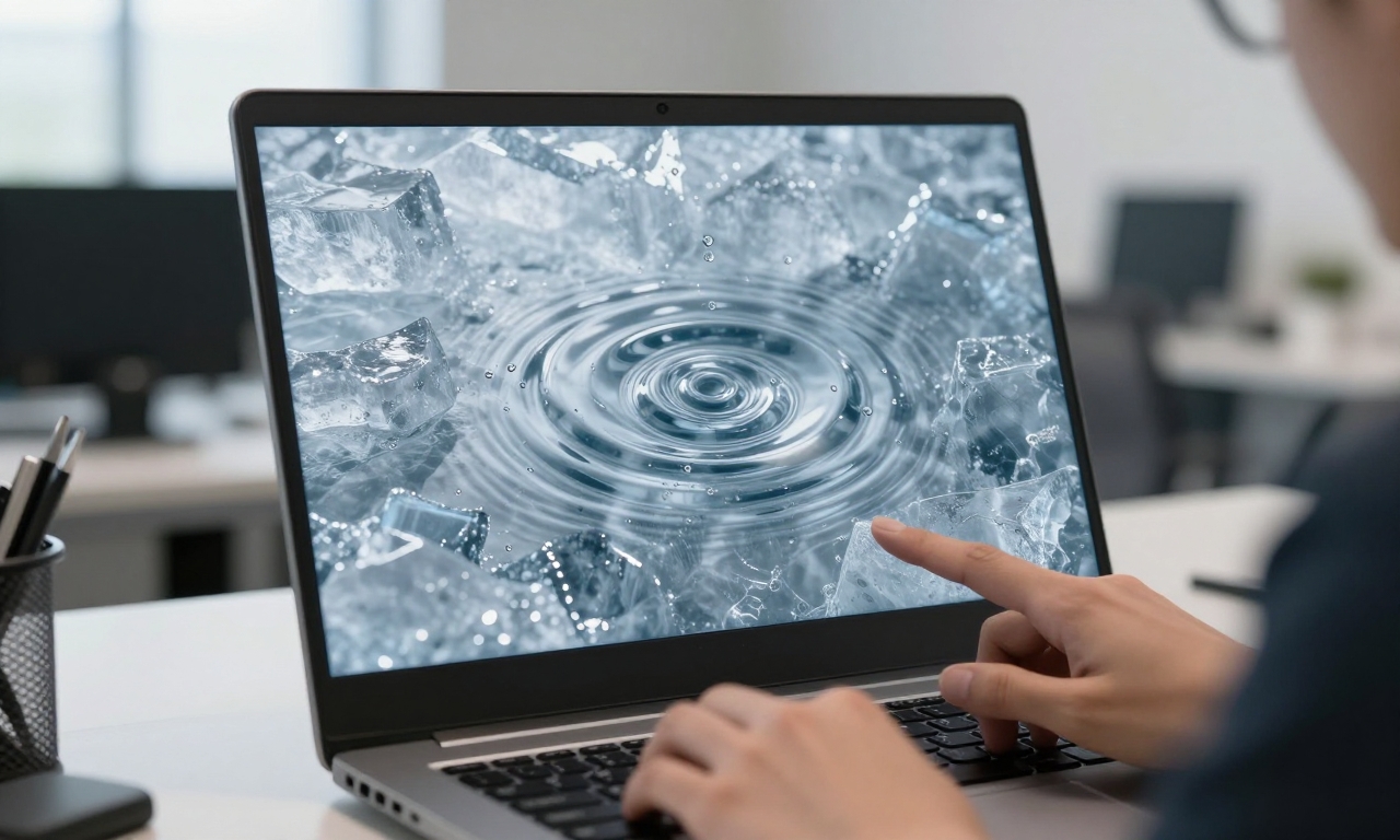
As a personal exploration, designers test Liquid Glass ideas by pairing a cold, aquatic aesthetic with a liquid-ice texture and a ripple on tap. The result is a tangible demonstration of depth that goes beyond look-and-feel: it becomes a hypothesis about how interfaces can respond to context, mood, and user intent. Such experiments help teams push for deeper interfaces that still respect human rhythms—quiet, fast, and readable in all conditions.
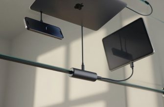
Looking ahead, the concept can scale across devices and contexts: from compact phone screens to larger tablets and wearable displays. The objective is not to force a single signature trick but to create a flexible design language that can blend depth with performance, accessibility, and personalization. The promise of Liquid Glass is not a gimmick but a base: a toolkit for richer, more humane interfaces that still feel natural to use.
While not every interface needs heavy depth, the principle remains valid: a design ecosystem that embraces multiple cues—glass, texture, motion, and color—tends to feel more cohesive and resonant. In an era of rapid updates and always-on devices, depth that serves clarity and delight may well define the next wave of mainstream UI.
Delight as a Core Design Metric
Delight is not a distraction; it is a measure of how well an interface supports real tasks with clarity and warmth. Liquid Glass offers a framework in which depth increases comprehension, motion clarifies intent, and texture communicates status without shouting. When depth and usability align, users spend more time with products and remember how they felt while using them. In this light, designing for delight becomes a practical discipline—one that values craft as much as function.
As the design language continues to evolve, the core idea remains: blend multiple depth cues, maintain performance, and prioritize user goals. Liquid Glass is the starting point for a broader conversation about humane interfaces—interfaces that look fresh without leaving the familiar behind.